Creating a Responsive WordPress Design: A Step-by-Step Tutorial
Введение
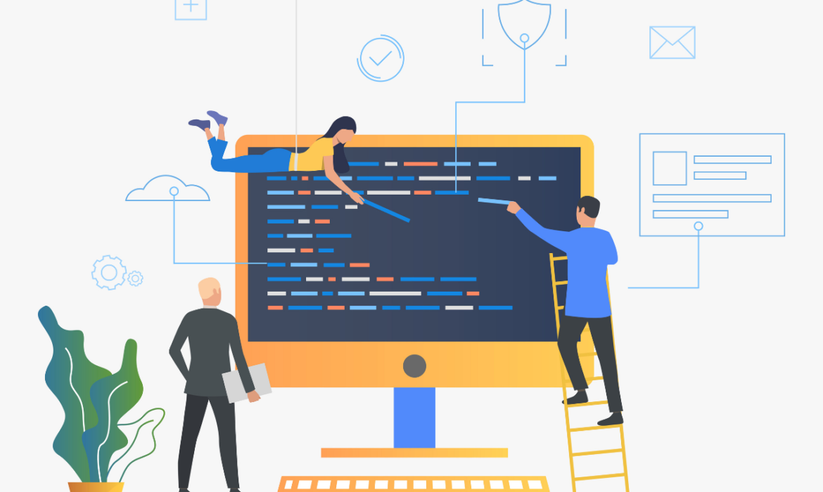
In today’s mobile-first world, having a responsive website is essential for reaching your audience and providing a seamless user experience. This guide will walk you through the steps of creating a responsive WordPress website that adapts flawlessly to different screen sizes.
Understanding Responsive Design Principles
- Fluid Grid Layout: Use a flexible grid system that adjusts to different screen widths.
- Flexible Images: Images should resize automatically to fit the screen.
- Media Queries: Use CSS media queries to apply specific styles for different screen sizes.
- Mobile-First Approach: Design for smaller screens first and then scale up.
Choosing a Responsive WordPress Theme
- Prioritize responsiveness: Select a theme explicitly designed for mobile devices.
- Check for customization options: Ensure you can tailor the theme to your brand.
- Evaluate speed and performance: Choose a theme that loads quickly on all devices.
- Review user reviews: Consider feedback from other users to assess theme quality.
Building a Responsive Layout
- Create a mobile-friendly navigation menu: Design a clear and easy-to-use navigation for smaller screens.
- Optimize content for mobile: Prioritize essential content and simplify layouts.
- Test on different devices: Use various devices to ensure optimal display and functionality.
- Consider touchscreens: Optimize buttons and interactive elements for touchscreens.
Optimizing Images and Media
- Compress images: Reduce file sizes without compromising quality.
- Use responsive images: Implement srcset and sizes attributes for efficient image delivery.
- Consider lazy loading: Delay image loading until they are needed.
- Optimize videos for mobile: Ensure videos play smoothly on different devices.
Testing and Refinement
- Use browser developer tools: Test your website on various screen sizes and devices.
- Gather user feedback: Collect feedback to identify areas for improvement.
- Continuously optimize: Stay updated with responsive design best practices.
Заключение
Creating a responsive WordPress website is essential for reaching a wider audience and providing an optimal user experience. By following these guidelines and staying up-to-date with design trends, you can build a website that looks great and functions flawlessly on all devices.
Нужна профессиональная настройка сайта? Связаться с нами сейчас.


 Русский
 ") English (UK)
English (UK)  Deutsch
  Français
  Nederlands
  Türkçe
  Español
  Polski
  Norsk nynorsk
  Dansk
Dansk  Latviešu valoda
  العربية
  Azərbaycan dili
  ქართული
  Slovenčina
  Čeština
  Português